Convert css-avatar into HTML + CSS code!
Recently someone posted a link with a "Minion created on pure CSS [and HTML]". For me it looked something usual because I know how powerful CSS has become. Especially with the appearance of CSS3, which has "stolen" some effects from JavaScript as CSS transitions and CSS animations.
After some moments I've decided to transform my own avatar into a "CSS masterpiece". This article is a depiction of the main steps of creating a CSS graphical element, in my case - an owl icon, which is also my avatar.
What CSS properties could help?
What CSS properties could help in achieving the goal? The main properties are the one which can position an element at the needed location, and the ones which can give us the shapes.
For the positions, there is the classical position property. And the main values: relative and absolute.
For the shapes, there are three most important properties: rectangles, circles, and triangles.
- Rectangles are achieved by simply filling a block, for example <div>;
- Circles with the help of border-radius;
- Triangles with the help of border and some magic.
.position {
  position: relative;
  position: absolute;
}

.rectangle {
  background: red;
  height: 100px;
  width: 100px;
}

.circle {
  border-radius: 100%; // make the corners perfectly rounded.
}

.triangles {
  border: solid transparent;
  border-bottom-color: red;
  border-width: 40px 20px;
  height: 0;
  width: 0;
}
Find the shapes in the image
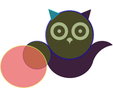
The image above shows some shapes that are "hidden" in the image. I've highlighted some of the figures:
- Head - a big circle at the top;
- Wing - two circles. The second circle is the one which "cuts" the main circle, and what's left is actually the wing;
- Ear - simple triangle turned by something like degrees.
There are some other parts left, like the body - which is a circle with
cutout top, eyes - which are circles as well, and the nose.
At first look the nose has a unique shape, and nothing mentioned above could
help. But when looking closer, it's actually a circle cut by two others.
Writing code
Basically we've got a lot of circles, and a pair of triangles. That sounds easy now. Next it's presented the HTML code for the block, and without any comments, you'll understand what's the function of each of it.
<div class="css-avatar">
  <div class="css-avatar__head"></div>
  <div class="css-avatar__body"></div>
  <div class="css-avatar__wings">
    <div class="css-avatar__wings__left"></div>
    <div class="css-avatar__wings__right"></div>
  </div>
  <div class="css-avatar__ears"></div>
  <div class="css-avatar__eyes">
    <div class="css-avatar__eyes__left"></div>
    <div class="css-avatar__eyes__right"></div>
  </div>
  <div class="css-avatar__nose"></div>
</div>
For the style code, I've used SASS preprocessor, as it makes the work a bit easier. But don't worry, there is no magic in the code above, so you will understand it easily.
// Variables.
$color-avatar: #3c203c;
$color-avatar-background: #fff;
$font-size-avatar: 16px;

// Functions.
@function em($size, $base-value: $font-size-avatar) {
  @return ($size/$base-value*1em);
}

.css-avatar {
  background: $color-avatar-background;
  font-size: $font-size-avatar;
  height: em(300px);
  overflow: hidden;
  margin: 0 auto;
  position: relative;
  width: em(300px);

  &__head {
    background: $color-avatar;
    border-radius: 100%;
    left: em(68px); // (300-164)/2
    height: em(164px);
    position: absolute;
    top: em(37px);
    width: em(164px);
    z-index: 20;
  }

  &__body {
    &:after,
    &:before {
      content: "";
      position: absolute;
      z-index: 10;
    }

    &:after {
      width: em(175px);
      background: $color-avatar-background;
      height: em(50px);
      left: em(63px);
      top: em(110px);
      z-index: 15;
    }

    &:before {
      background: $color-avatar;
      border-radius: 100%;
      left: em(61px); // (300-178)/2
      height: em(180px);
      position: absolute;
      top: em(88px);
      width: em(178px);
    }
  }

  &__wings {
    &__left,
    &__right {
      &:after,
      &:before {
        content: "";
        position: absolute;
        z-index: 30;
      }

      &:after {
        background: $color-avatar-background;
        border-radius: 100%;
        content: "";
        height: em(142px);
        position: absolute;
        top: em(155px);
        width: em(142px);
        z-index: 30;
      }

      &:before {
        background: $color-avatar;
        border-radius: 100%;
        content: "";
        height: em(65px);
        position: absolute;
        top: em(140px);
        width: em(86px);
        z-index: 30;
      }
    }

    &__left {
      &:after {
        left: em(-73px);
      }

      &:before {
        left: em(-5px);
      }
    }

    &__right {
      &:after {
        right: em(-73px);
      }

      &:before {
        right: em(-5px);
      }
    }
  }

  &__ears {
    &:after,
    &:before {
      border: solid transparent;
      border-bottom-color: $color-avatar;
      border-width: em(40px) em(20px);
      content: "";
      height: 0;
      position: absolute;
      top: em(-7px);
      width: 0;
      z-index: 10;
    }

    &:after {
      right: em(57px);
      transform: rotate(42deg);
    }

    &:before {
      left: em(57px);
      transform: rotate(-42deg);
    }
  }

  &__eyes {
    &__left,
    &__right {
      &:after,
      &:before {
        content: "";
        position: absolute;
        z-index: 40;
      }

      &:after {
        background: $color-avatar-background;
        border-radius: 100%;
        height: em(12px);
        top: em(101px);
        width: em(12px);
        z-index: 45;
      }

      &:before {
        border: em(12px) solid $color-avatar-background;
        background: $color-avatar;
        border-radius: 100%;
        height: em(63px);
        top: em(75px);
        width: em(63px);
      }
    }

    &__left {
      &:after {
        left: em(108px);
      }

      &:before {
        left: em(82px);
      }
    }

    &__right {
      &:after {
        right: em(108px);
      }

      &:before {
        right: em(82px);
      }
    }
  }

  &__nose {
    background: $color-avatar-background;
    border-radius: 100%;
    height: em(24px);
    left: em(139px);
    position: absolute;
    top: em(130px);
    width: em(22px);
    z-index: 40;

    &:after,
    &:before {
      background: $color-avatar;
      border-radius: 100%;
      content: "";
      height: em(24px);
      position: absolute;
      width: em(22px);
      top: em(10px);
    }

    &:after {
      left: em(-11px);
    }

    &:before {
      right: em(-11px);
    }
  }
}
Result
You can get the code and change it as you want.
CODE LINK